Promoting community engagement through user-friendly design.

PROJECT TYPE
End-to-end app + branding
ROLE
UX/UI designer
INDUSTRY
Voluntary and Community Sector
TOOLS
Figma, Miro
DURATION
3 months
Project Context
Volunteering has been associated with numerous positive effects on overall well-being, including improved mood, decreased depression, increased social interactions, and diminished feelings of loneliness. In an age marked by increasing digital connectivity, Come Together recognizes the potential to leverage technology to get young adults involved in their communities and foster meaningful offline, in-person connections.
Problem
People want to volunteer, but don’t take the initiative to seek out opportunities. Research has shown that while over 90% of Americans want to volunteer, only 1 in 4 actually do*.
The primary barriers to volunteering include insufficient free time, lack of awareness about opportunities or disinterest in available options, and the absence of direct invitations.
*Stanford Center on Longevity, 2022
Solution
Come Together is an app that empowers individuals by seamlessly facilitating the discovery of and engagement with volunteer opportunities. Come Together allows users to follow along and interact with their peers' volunteering activities, fostering a sense of community and accomplishment.


Discovery
To better understand my user, I conducted a survey to collect information about people’s sentiments regarding volunteering and community involvement. Recognizing the need for deeper insights, I followed this with one-on-one interviews to uncover the motivations and emotions driving their survey responses.
100%
of survey participants believe that giving back to their community is very important.
100%
of survey participants felt that volunteering with friends would make them more inclined to volunteer.
70%
of survey participants reported volunteering rarely or not at all.
96%
of survey participants reported that they would be interested to follow their peers' volunteering activities
Understanding the User
I created personas and user journey maps to understand my users’ diverse needs, behaviors and motivations.


User Journey Map for Dylan Adams
Dylan's Goal is to find a local non-profit that helps the homeless and form connections with fellow volunteers and the organization.

Designs
Visualizing a User-Centric Experience
I conducted ideation exercises to generate design concepts for key screens of the "Come Together" app and website. These initial sketches laid the groundwork for further iterations in subsequent design phases.
Recognizing the prevalence of mobile usage among young adults, I prioritized the mobile user experience to cater to this demographic.

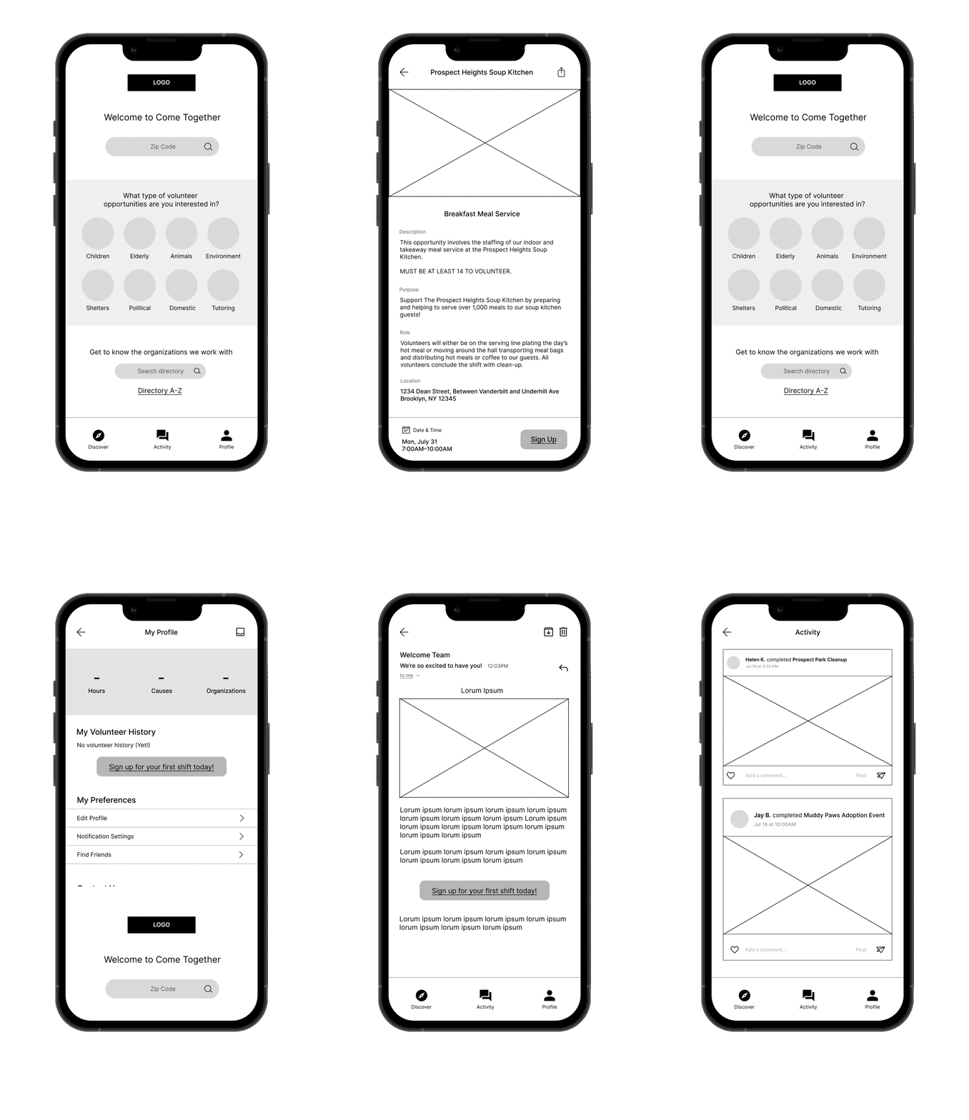
Digital Wireframing
When crafting my initial digital wireframes, my main priority was ensuring that first-time users could easily filter volunteer opportunities by location and cause.

I prioritized the search feature so users could quickly filter events by their location
I wanted an intuitive and visual way for users to filter opportunities by interests

Usability Study #1
I conducted a usability study of the low-fidelity prototype to evaluate its effectiveness in meeting user needs and identify areas for improvement.
Usability Study Key Insights:
-
Users were unsure about how to get started and whether they should search for opportunities by zip code or by cause
-
Users wanted more intuitive titles for destinations in the navigation bar
-
Users needed better cues for finding their notifications
Usability Study Parameters:
Unmoderated | 5 Participants | United States | 10-15 minutes
Iterating
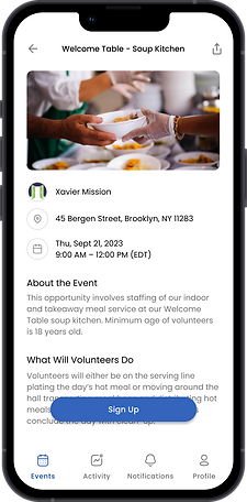
Using the insights from my usability study, I redesigned the layout of the homepage and implemented a 4-destination navigation bar for clarity.
Before

After

High-Fidelity Prototype

Second Usability Study
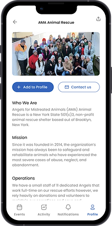
My second usability study of the high-fidelity prototype yielded three main insights that were incorporated into future iterations.
Insight #1
Participants indicated a need for more comprehensive filter options, including the ability to filter events by organizations.
Before

After

Insight #2
Users expressed the desire to browse events using a map view, enhancing their visual understanding of event locations.
Before

After

Insight #3
Users called for clearer cues to identify hyperlinks within the interface.
Before

After

Accessibility Considerations
Throughout the design process, I ensured that accessibility was a core element of my approach. I used varying text sizes and headings to establish a clear visual hierarchy. My original color palette didn't pass WCAG accessibility standards so I changed my main color from orange to blue to create an inclusive and user-friendly experience.
Responsive Design
After developing the mobile app, I created responsive designs to ensure a consistent user experience across various devices, focusing on information architecture to construct a comprehensive sitemap.

Impact
The Come Together app presents a promising opportunity to motivate and empower individuals to volunteer more and become actively engaged with local community causes. The social component adds connectivity and accountability, enabling users to find community through volunteering.
“I think this app would definitely encourage me to volunteer more and get more involved. The social aspect would also make this a fun way to volunteer with friends or to meet new people through volunteering.”
Takeaways
Throughout this project, I discovered that people’s feelings do not always align with their actions. As the survey revealed, 70% of participants admitted to volunteering rarely or not at all even though they all feel that community service is important.
Project Constraints
Completing this project within the confines of a bootcamp presented challenges, particularly in terms of collaboration and user testing. Working independently, I navigated the design process on my own, learning and refining my approach through trial and error.
When conducting usability tests, I had to rely on a limited pool of friends and family to act as participants, which hindered the diversity of feedback. Ideally, a more diverse group of participants would have provided a richer understanding of how different demographics interact with the product. Additionally, while unmoderated usability studies were chosen for convenience, having the option to conduct moderated sessions would have allowed for deeper exploration of user behavior and preferences.
Next Steps
1. Conduct Usability Study
To ensure that Come Together continues to meet the evolving needs of users, I would want to conduct a usability study of the updated website prototype. This will help to address any remaining pain points and fine-tune the user experience.
2. Consider Integrations
Exploring integrations with popular social media platforms could enhance user engagement and make it easier for users to share their volunteering experiences with their social networks. This could also amplify the platform’s reach and impact.