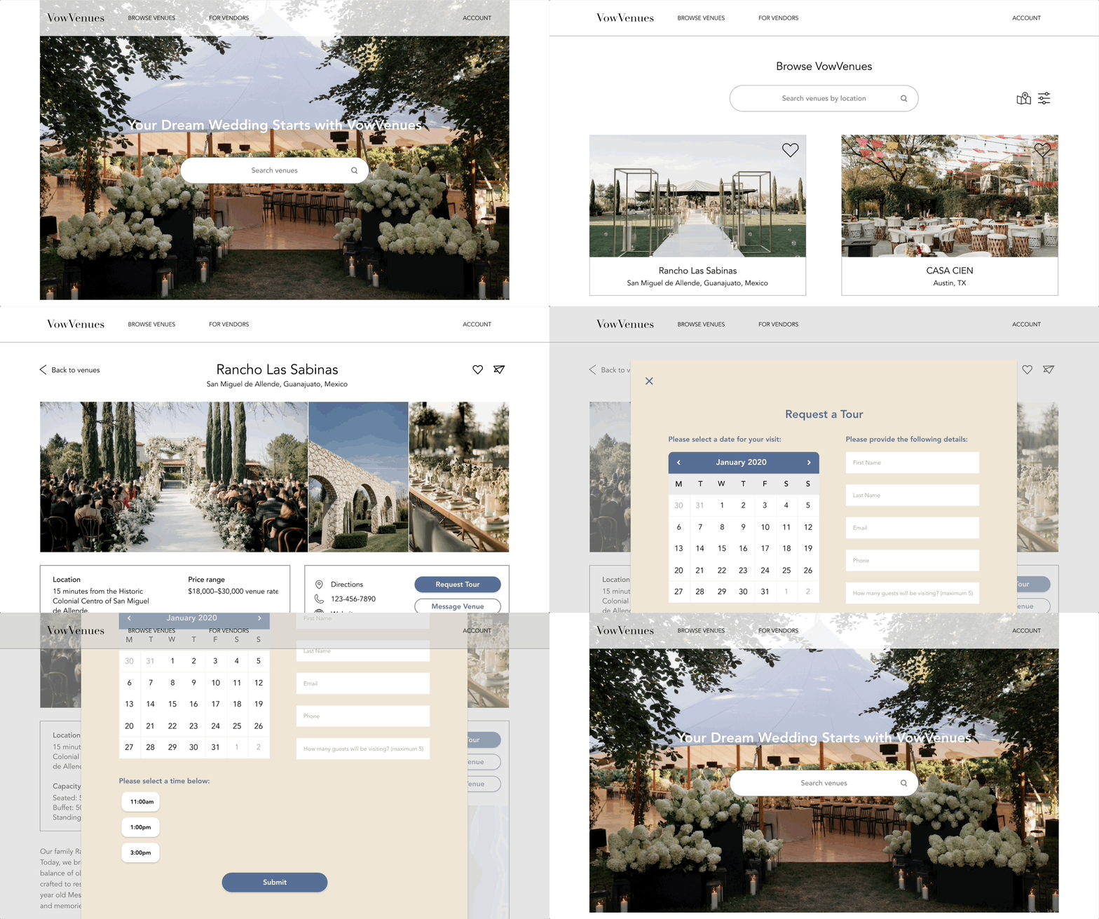
Optimizing wedding venue search with transparent pricing.

PROJECT TYPE
End-to-end app + branding
ROLE
UX/UI designer
INDUSTRY
Wedding and Events
TOOLS
AdobeXD, Miro
DURATION
2 months
Project Context
From 2018 to 2023, the Wedding Planners industry experienced a decline in revenue due to a growing trend among couples to self-plan their weddings. Despite this trend, the decision to choose a venue remains one of the most critical aspects of wedding planning. As couples take on more responsibility, the need for comprehensive and user-friendly resources, such as platforms like Vow Venues, becomes increasingly important.
Problem
Finding a wedding venue independently can be stressful due to the lack of price transparency in the industry. Often, couples are given incomplete information from venues, which adds to the frustration and inefficiency of correspondence. Managing communication with multiple venues exacerbates this stress, requiring constant back-and-forth to gather necessary details and schedule visits.
Solution
Vow Venues simplifies finding the perfect wedding venue with curated recommendations, detailed descriptions, transparent pricing, and a side-by-side comparison tool, empowering couples to choose the venue that's right for them.

Discovery
I conducted interviews and crafted empathy maps to deeply understand the needs of the users I'm designing for. These interviews revealed common challenges and pain points encountered during the wedding venue search process. This feedback was also incorporated as an input in my persona creation.
Pain Points
Lack of price transparency: Customers often discover venue costs only upon visiting in-person, leading to uncertainty and potential budgeting challenges.
Wedding planning is overwhelming: Managing all aspects of wedding planning without professional assistance can feel overwhelming, with numerous details to track and decisions to make. Choosing a venue is one of the most important decisions a couple has to make when planning a wedding.
Inefficient communication: The varied communication methods employed by different venues result in disjointed correspondence, making it difficult for customers to manage inquiries effectively.
Time consuming: Finding venues that meet specific criteria is very time consuming, adding to the overall wedding planning workload.
Understanding the User
I created personas and user journey maps to understand my users’ diverse needs, behaviors and motivations.


User Journey Map for Annabelle Hart
Annabelle's goal is to find a wedding venue in her budget that has availability on her preferred date.

Designs
Visualizing a User-Centric Experience
I began by sketching paper wireframes to generate design concepts that would effectively address the pain points of my personas. My initial sketches, as well as all future iterations prioritize beautiful, high-resolution imagery of weddings and venues in an effort to captivate and inspire users as they navigate the site.

Digital Wireframing
In crafting my digital wireframes, my focus was on creating venue pages with comprehensive information, high-quality imagery, and easy ways to message venues and schedule visits. Additionally, I considered implementing a side-by-side venue comparison feature to facilitate easy comparison across various criteria.

Usability Study #1
I conducted a usability study of the low-fidelity prototype to evaluate its effectiveness in meeting user needs and identify areas for improvement. My usability study yielded three main insights that were incorporated into future iterations.
Usability Study Parameters: Unmoderated | 5 Participants | United States |10-15 minutes
Insight #1
It wasn't clear to users whether they should navigate to the "Account" or "Sign up/Log in" page to create an account. To eliminate confusion, I consolidated the navigation bar.
Before
After

Insight #2
Users wanted the ability to browse venues on a map.
Before
After

Insight #3
Users wanted to see photos of previous weddings at each venue.
Before
After

High-Fidelity Prototype
Based on the feedback from my initial usability study, I created a high-fidelity prototype.

Impact
Although still in its conceptual stage, the impact of this wedding venue website concept resonates strongly with its target users. By centralizing communication and comparison tools, the platform streamlines what can often be a complex and time-consuming process. Offering comprehensive venue information upfront represents a paradigm shift in wedding planning, alleviating the need for multiple site visits and allowing couples to make more informed decisions from the outset.
"This would have been very helpful for me and my husband when we were looking for our wedding venue. Vow Venues also feels more editorial compared to other wedding websites I've seen, like Zola or The Knot, which feel like they're just trying to sell you something."
Takeaways
The main takeaway from designing Vow Venues is the importance of simplicity; eliminating unnecessary elements is crucial to prevent distractions and ensure users can focus on core tasks amidst the complexity of wedding planning.
Project Constraints
Completing this project within the confines of a bootcamp presented challenges, particularly in terms of collaboration and user testing. Working independently, I navigated the process on my own, learning and refining my approach through trial and error. In conducting user tests, I had to rely on a limited pool of friends and family, which hindered the diversity of feedback. Ideally, a more diverse group of participants would have provided a richer understanding of how different demographics interact with the product. Additionally, while unmoderated usability studies were chosen for convenience, having the option to conduct moderated sessions would have allowed for deeper exploration of user behavior and preferences.
Next Steps
1. Enhance Side-by-Side Venue Comparison Feature
Develop the feature to enable seamless addition or removal of venues for comparison.
2. Conduct Follow-up Usability Study
Conduct a usability study of the updated website prototype to address any remaining pain points and fine-tune the user experience.